Javapapers Redesigned
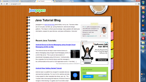
Javapapers was running on a colorful design for many years. Like everybody, I too like lots and lots of colors. Years back, when I did the design only two things were in my mind, I wanted bright colors and wanted the site to feel like a notepad of papers. I succeeded in that design and I liked it. But, there were many problems that accompanied the beauty,
- Heavy use of images and so ridiculously slow.
- Not navigation friendly.
- Rigid layout
Responsive Design
Recently I started to work on a new design with the following objectives,
- Should be functional
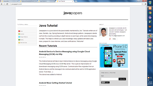
- Wide width for content
- Lesser colors to reduce distraction
- Large font size for comfortable reading
- Tutorial style navigation
- Responsive design
- Mobile, tablet and all devices compatible.
- Quick loading pages
- Minimalistic
The whole design is handcrafted exclusively for Javapapers. It is launched today as beta and there might be minor glitches here and there. Need to test on multiple devices and the work is in progress. In another couple of weeks everything will be ironed out and polished.
I am looking forward eagerly to your feedback on this new design. As always thank you for your support for Javapapers.
Comments on "Javapapers Redesigned"
Comments are closed for "Javapapers Redesigned".


Good to see the redesigned look of Java papers. Navigation and categorization of topics on left side of the page will be really helpful. I will be missing cup of coffee from the new look :( Thanks for your efforts to keep Java community alive and inspiring.
it is good.. from past couple of years I am following this site…it is more helpful to me
Nice work Joe.. Beta on April 1 ..hmm that’s intersting :)
Nice !!
looking good ..
Thanks Omkar.
Yes, missing the coffee cup. Its a large image and reluctantly I had to remove it.
Tutorial menu navigation on the left sidebar is an important aspect of this redesign. There is no off the shelf plugin available for this kind of work. We had to put together multiple plugins and do some custom code and got it work. It is one of the kind given the platform we use for Javapapers.
Thanks Vishal.
April 1 was a coincidence. Plan was to complete the design work by mid-march and it got extended. I was working late into the night yesterday and when I launched the design it was 3:00 AM. Only today morning when my son played a prank on me, I realized its April 1 :-)
Hi Joe,
Iam one of the follower of javapapers. Good to see the new design but suddenly found the page as empty compared to te notepad verion. But anyways the contents are more clear, but missing the next and previous pages.Thanks for the compatibility.
Looks good on an iPad Air…..
Great! :) It seems updating software with new version ;) :)
its really good idea
Nice and Elegant design Joe.
Thank you so much Matt. I feel elated when I saw your comment. Happy because you are watching :-)
Facing an issue on iOS devices. Based on the device width, I am removing the sidebars. For example, on mobile devices we should not have both sidebars. On pads only one sidebar should be there. This is working well on Android devices. But in iOS (tested with my iPhone), the sidebars are present. Need to fix this.
Hey Pooja,
This has consumed hours and hours. Right from conceptualizing a design, to code it and test it.
Most of the time was spent on working on the Menu bar (left side navigation) stuff. I am telling you a secret now, that’s done by my wife ;-)
Thanks Pushkar.
Thanks Pratik.
Thanks.
Lots of clean space is intentional.
Next and previous links are present in other posts. It will come and go contextually.
Great…It’s looking very nice.
It’s not just what it looks like and feels like. Design of Java papers said how it works.(Specially Left side navigation).Elegant and Simple UI.
and BTW, it loaded quickly on the never-fast WiFi on the train…
i liked the tutorial style.. looks more organized :)
its really nice
this is the best news…
Man, you hit it on the head. That was what I was hoping for. Thanks.
Missing the old look, it was like reading from notebook kept on a Table.
Missing a lot!!!!
this is awesome man………… better than before one
Its a great help for java lovers. Thanks Joe
I also miss those colors and that coffee cup.
But its time we upgrade. We had to do this now or we will be left behind.
Thanks :-)
Welcome Githin.
I like the new one. Its simple and neat ! Look forward to read more articles from you :-)
Thanks Arvind.
Joe ,
New design looks good and simple .But old one was very colourfull and attractive ,i liked that paper theme very much :-)
Looks good. One suggestion thought
please provide a link to navigate to the top of the page.
It’s nice of you that you forwarded to the new responsive look which is necessary in real time. But in your old look every morning i was feeling like i’m reading my java and android notes on my table near the window. Missing that look. but i’m having some of your old tutorials with that look. so whenever i miss it. i’ll take a look on it. Nice Going Sir…. :)
Good work SIR …!
The revamp is great with a great deal of readability and user-friendliness, Sir!!
Hello Joe,
It would be more professional if you remove adds from your site. Just an advise. Keep up the good job.
Good Job….
Thanks for the thought Kevin. Sure I agree with that.
There are other personal consequences for that, but sure I will try to remove them soon.
Thanks Sanket. Hope you will get used to this new theme soon.
Yes, its there in tutorial pages. Those navigation will appear and go contextually.
Thanks Firoz. We have to let go some things we like at certain times. Otherwise we will be left behind.
Hiii Joe Nice Look thats the only best java tutorial site.Great work Bro.
Thanks Kunal.
That’s also true…
Better than last one, I think you used wordpress for this.
Neat work! Neatly labelled, well maintained.
I have been following your page since Virtusa. Keep up the good work. Thank you.
Yes Reddy, I am using the WordPress as the platform. This responsive theme is custom developed.
Thanks Hari. Happy that you are following Javapapers for long.
Keep sharing :-)
Great Job Joe!! :) Liked the new look specially left side navigation.
Thank you.
Thanks Deepti. Left side menu is a WordPress plugin custom designed exclusively for us. Happy you like it.
I would suggest to use some cache plugin for your site. W3 Super Cache or W3 Total Cache
Pavan, I am using “Hyper Cache” plugin.
Do you experience slowness or is it noticeably slow in responding. Please let me know.
Hello Sir,
I have been following your site since last 2 years and am pleased to see the new design. This site has been very helpful to me and inspires me to start my own blog.
I am curious to know how much time, effort, and money you spend on running this site. Also, could you roughly tell us how much you earn from adsense ;-)
This will help newbies like me to get an idea. Thank you!
New Look is fine .
Tutorial menu navigation on the left sidebar looks good but too small , please increase the size. And header contains only text “javapaper” , add some images or something because lot of space is left blank in header.
Hi,
Congrats !!! for you have decided to change the theme.
The new design looks pretty good.
But I found few little annoying stuffs ..
1. Since the primary color for background is white, to produce white color of LED or LCD , all 3 primary colors (red,blue,green) have to be illuminated, which causes quicker battery power draining.
2. Left panel for navigation is great , but it does not match the theme.It looks like a hanging piece of photo frame.
3. The content pane (center) is still not wide enough.If you could move ‘about’ & ‘google ads’ to header, a wider space can be achieved.
4. Fond color is black , a 100% contrasting color to white background, which causes motion blur while scrolling and its kind of head ache.
5. Date & reply links are too bright and fond is too small.
I wish you take a look at apple.com for betterment of Look and Feel.. !!!
A good design immerses the reader into content !!!
And not distract him !!
Hey Man, You are rocking. Keep going
[…] New design was launched, people poured in comments, they were happy and so I was happy too. Along with the new design, I brought in a new component to the site. It was a context-sensitive navigation menu. It was a killer feature (that’s what I thought) and some of the readers too liked it. […]